As the world of interior design evolves, each year beckons a new palette of colours that define homes and inspire creativity. Looking ahead to the vibrant tapestry of 2026, experts have weighed in, revealing an exciting shift in the hues we can expect to see gracing UK homes. Gone are the days where muted neutrals reigned supreme; the upcoming trends are infused with rich tones and vibrant undertones, promising to revitalise spaces and usher in a sense of warmth and elegance. From the dramatic depth of burgundy to the calming serenity of navy blue, the anticipated colours embrace both tradition and modernity, merging styles to create unique environments. This year promises an infusion of personality and style through the artful play of colour, guided by the expertise of interior designers who keep their fingers on the pulse of home decor trends.
The Bold Comeback of Burgundy in Home Decor
Among the standout shades predicted to dominate is the captivating hue of burgundy. This deep, almost luxurious colour finds its roots deeply entrenched in vintage aesthetics, reminiscent of Victorian theatres and grand manor houses. Burgundy not only evokes a feeling of sophistication but also invites an air of comfort within any space. In recent months, interest in this shade has surged, with search traffic relating to burgundy reaching an all-time high, particularly around the festive season when many sought out the colour for holiday decorations. This increasing popularity speaks volumes about the desire for homes that not only look good but also tell a story.
The beauty of burgundy lies in its flexibility; it can be paired with a variety of accent colours to create distinct atmospheres. For instance, when combined with gold accents, burgundy creates an opulent look that can transform a mundane living area into a theatre-like sensation. Picture gilded picture frames against richly painted walls. Alternatively, the introduction of softer hues like pink or cream can lighten the heaviness of burgundy, making it suitable even for smaller spaces without overwhelming the senses.
Pairing Burgundy with Other Popular Tones
To further enhance its versatility, burgundy works exceptionally well alongside other trending colours. The rich tones of the colour can be juxtaposed with cool shades, such as navy blue, which brings a sense of tranquillity and balance. Navy, in this context, acts as an anchor that enhances the drama of burgundy, making rooms feel both comforting and grand. Culinary spaces can particularly benefit from this combination; using burgundy for cabinets or accent walls while opting for navy countertops or upholstery creates a stunning culinary backdrop.
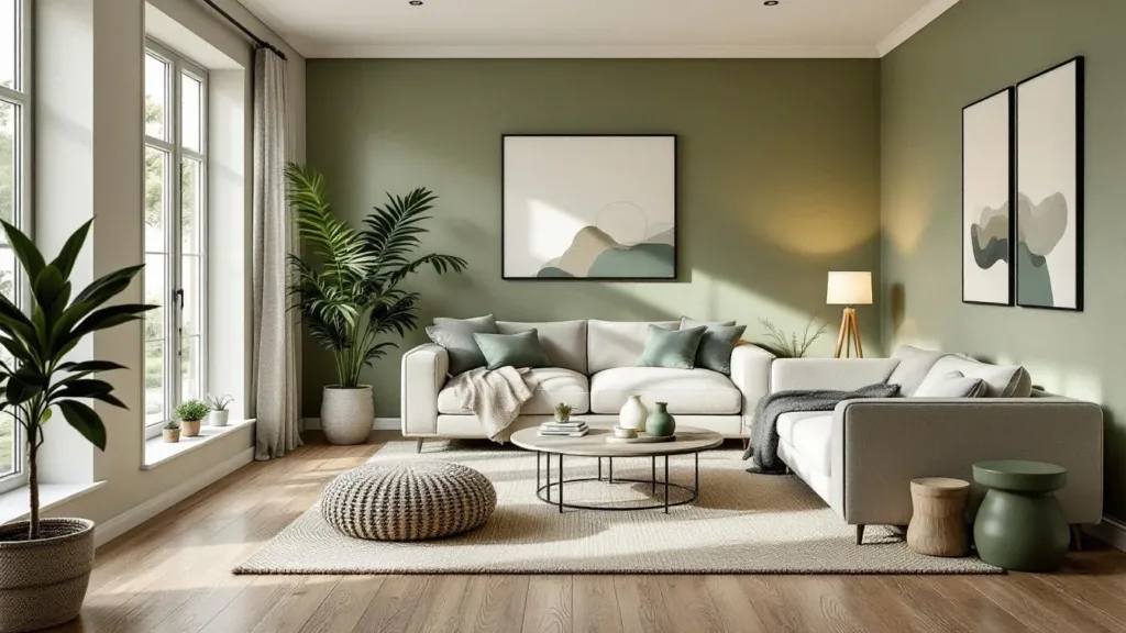
Moreover, the warmer undertones that commonly accompany burgundy can seamlessly integrate into a palette utilizing greens, particularly muted sage or olive. The combination of these shades can cultivate a naturalistic vibe reminiscent of lush English gardens, making it an ideal choice for those looking to bring the outside in.
The Rise of Navy Blue as a Timeless Classic
Navy blue, often regarded as a timeless staple in the colour wheel of interior design, continues to retain its appeal in 2026. This versatile colour not only adds depth but also acts as a peaceful refuge amidst the vibrant shades of the contemporary palette. Its ability to promote calmness is often highlighted by designers, making it an ideal choice for bedrooms and study areas where relaxation is paramount.
But what truly distinguishes navy blue in 2026 is its capacity to adapt and fit into various home styles. Modern townhouses in urban settings can benefit from navy walls combined with sleek, minimalist furnishings to create a sophisticated urban environment. A carefully chosen array of accessories, such as brass light fixtures or cool silver tones in furniture, enhances this aesthetic, providing a gentle contrast that keeps the ambiance light yet dramatic.
Navy Blue in Combination with Other Hues
As an interior colour, navy isn’t confined to being merely a standalone shade. Its interaction with other colours can yield extraordinary results. Designers suggest pairing navy blue with rose pink to bridge the gap between nostalgic charm and contemporary flair. This pairing not only draws attention but imbues spaces with an inherent vibrance.
The boldness of rose pink, complemented by navy’s calming nature, creates environments that feel both youthful and sophisticated. For those inclined towards a more playful, maximalist approach, introducing other jewel-tone accents like emerald green can further invigorate the space, bringing about a harmonious balance that is nothing short of captivating. This artistic interplay demonstrates how an intelligent selection of colours can elevate the total aesthetic and emotional feel of a home.
Vermillion: A Vibrant Addition to Interior Design
As the palette for 2026 expands beyond the more traditional hues, the striking colour of vermillion emerges as a bold contender for those willing to embrace a vibrant touch in their interior design. This vivid orange-red colour possesses a warmth reminiscent of summer sunsets, making it perfect for spaces that are meant to welcome guests or encourage creativity. Vermillion can serve as a surprising base or an accent that breathes life into otherwise muted rooms.
When used strategically, vermillion can evoke a sense of warmth and energy, particularly when paired with gentle blues or greens. For instance, in contemporary living rooms, vermillion accents on cushions or wall art can create a dynamic contrast against walls painted in soft sky blue or mint green. This dynamic can elevate the liveliness of the space, ensuring it resonates with energy and comfort.
Maximalism and Vermillion’s Role
The resurgence of maximalism in design heralds the perfect environment for vermillion to thrive. Its striking presence can be accentuated when coupled with rich, dark colours, creating visual drama in places like kitchens or dining areas. For instance, one might opt for vermillion cabinets with deep charcoal countertops—as this combination evokes a modern yet warm atmosphere perfect for home-cooked meals and gatherings.
As homeowners continue to experiment with their designs, vermillion is expected to find its way into more unconventional places, such as bathrooms or entryways, where it can serve as a breath of fresh air amid more subdued colours. By embracing this hue, individuals can boldly transform their spaces into unique expressions of their personalities and preferences, echoing the adventurous spirit of 2026.
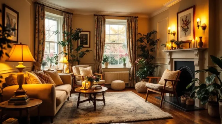
The Appeal of Gold Accents in Contemporary Interiors
The new trends in interior colours are not limited to hues alone; the use of metallic accents, particularly gold, is set to create waves in 2026. The revival of maximalism has seen gold reemerge as a dominant force, introducing an atmosphere of luxury and sophistication to various home styles. It’s essential to understand the nuances of using gold so that it enhances rather than overwhelms beautiful spaces.
Carefully curated gold accents, strategically placed within a room, can bring a sense of warmth and texture that is undeniably alluring. For example, gold fixtures in kitchens or living rooms can tie together the colour themes while exuding elegance. When paired with plush fabrics, such as velvet or silk, gold accents create an opulent ambience conducive to relaxing evenings and lavish gatherings.
Integrating Gold for Maximum Impact
While adding gold can indeed create a stunning effect, it is important to work with it judiciously. Designers often recommend complementing gold with darker tones, such as the aforementioned burgundy or navy blue, creating a rich atmosphere that feels inviting and stylish. Additionally, lighter neutrals can serve as a canvas against which gold shines bright, allowing it to enhance the overall aesthetic without overwhelming the space.
Furniture elements, like coffee tables or side tables, offer ideal opportunities to integrate gold. Such choices can anchor a room while simultaneously providing paths for eye movement throughout the decor landscape. By sprinkling gold accents throughout a home, one can ensure that spaces remain inviting without losing that unique touch that personalizes a style.
The Lasting Importance of White and Neutrals
While vibrant colours claim their place in the spotlight, the longstanding charm of whites and neutrals continues to hold significance in contemporary decor. These shades, particularly Pantone’s Colour of the Year—Cloud Dancer—promote an ethereal quality, perfectly suited for modern minimalist aesthetics. In spaces with restricted dimensions, employing whites or soft neutrals such as greys and beiges can enhance lighting and create an illusion of openness.
The appeal of white and neutral palettes lies in their versatility; they serve as excellent backdrops that allow other hues and furnishings to stand out. Designers frequently advocate for their continued usage in small flats or bijou homes, where the potential for overcrowding can be mitigated with a clean, light colour scheme. Through the intelligent use of these shades, one can endeavor to achieve balance, ensuring tranquil escapes in the hustle and bustle of daily life.
The Evolution of Warm Neutrals
As the trend continues to evolve, the palette of neutrals is also shifting from cold undertones to warmer hues, making spaces feel more inviting. Shades such as warm taupe and soft clay embrace an earthy quality, reflecting natural elements that resonate with the design ethos of 2026. Integrating these warm neutrals can ground a space and provide a sense of stability, aligning with the greater trend towards nature-inspired interiors that speak of harmony and sustainability.
Ultimately, whites and neutrals possess an inherent charm that frames the vibrant colours in a room, creating dynamics that elevate the overall atmosphere. These shades allow the heart of the home to shine while maintaining a minimalistic grace that never goes out of style.
Understanding the Shift towards Nature-Inspired Interiors
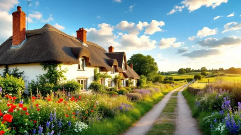
As the palette for 2026 takes shape, a clear trend emerges that speaks to a longing for natural connection within home design. The increasing desire for nature-inspired interiors reflects a yearning for tranquillity and comfort—elements that can often be overlooked amidst the chaos of modern life. This shift towards incorporating earthy hues, such as soft clays, muted moss, and terracotta tones, underscores a collective aspiration for peace and grounding in one’s surroundings.
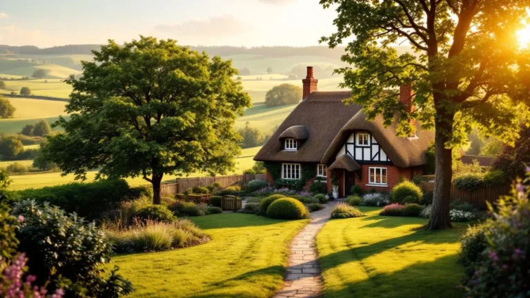
Such shades, steeped in warmth and familiarity, create atmospheres that echo the gentle embrace of the countryside, invoking images of rustic cottages nestled among rolling hills. Designers highlight that by weaving in these motifs, homeowners can foster environments that speak of comfort, nurturing their emotional well-being.
Creating Serenity with Nature-Inspired Hues
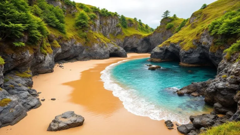
In terms of practical application, more homeowners are embracing the concept of using nature as a muse in their decor. By selecting shades that directly reflect their environments, individuals can create living spaces that feel both personal and vibrant. Examples include earthy greens that reverberate with the lushness of the Scottish Highlands or sandy tones reflecting the soft coasts of Brighton.
As 2026 unfolds, the power of colour resonates deeply with the desire for self-expression and personal sanctuary, calling attention to the fact that homes are a reflection of individual stories. By choosing shades that complement one’s unique lifestyle, the spaces we inhabit can transform into havens that bring happiness and serenity.